Exploring a desktop solution for a mobile app
The challenge
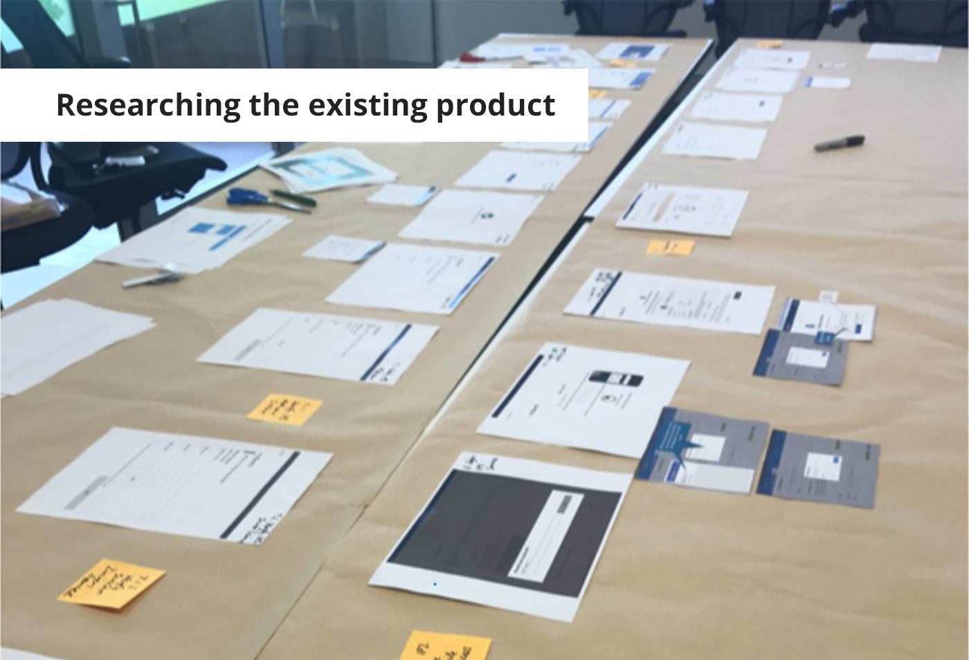
The product team wanted to explore a browser-based version of their mobile app to support users during a lengthy sign-up process. Research showed that users were often confused by the need to switch devices mid-process—starting on mobile and then returning to their desktop. This channel shift caused drop-offs and friction, highlighting the need for a more cohesive cross-platform experience.
The solution
Working in a small UX team, we rapidly moved from concept to a high-fidelity, testable prototype:
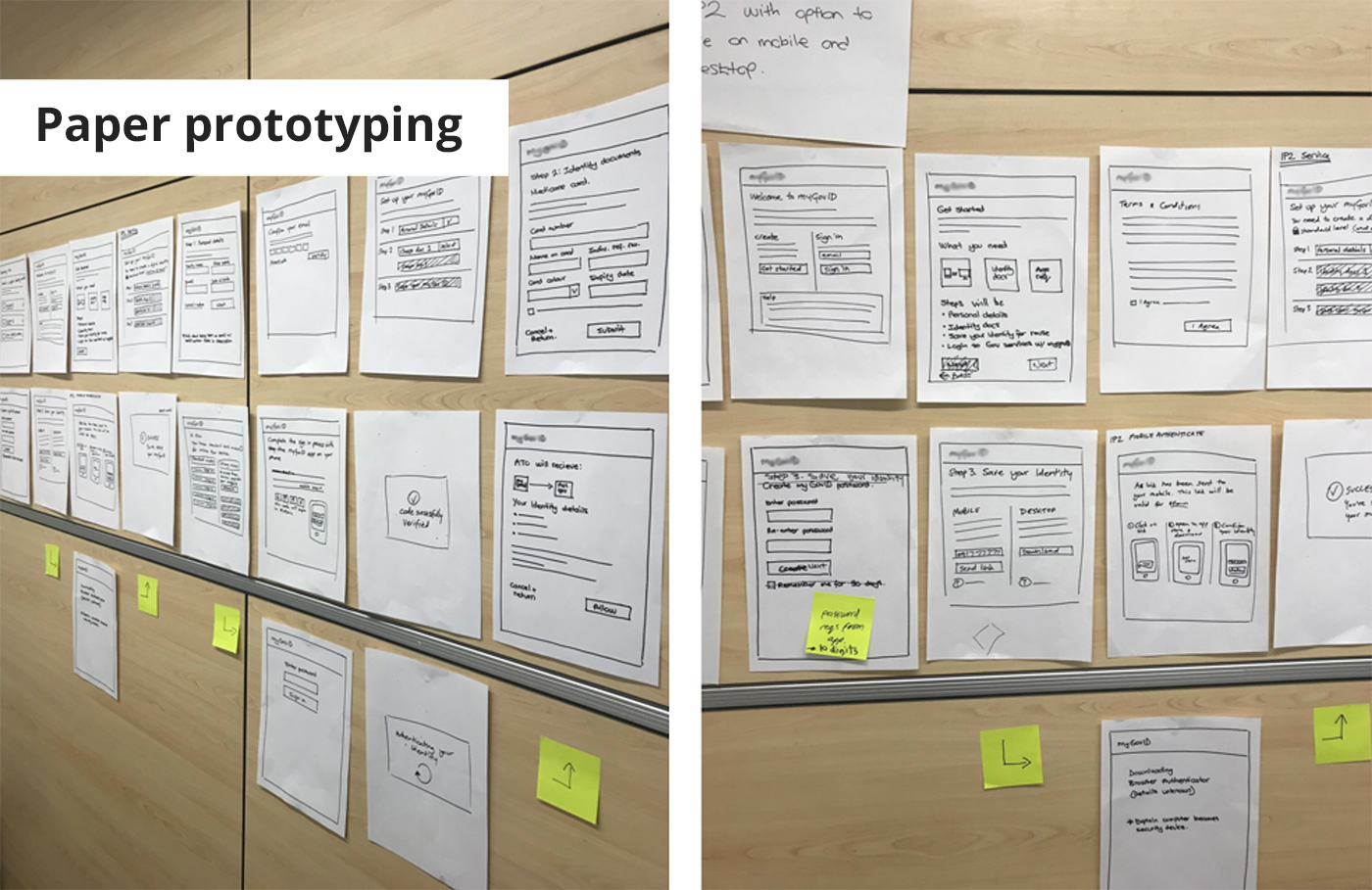
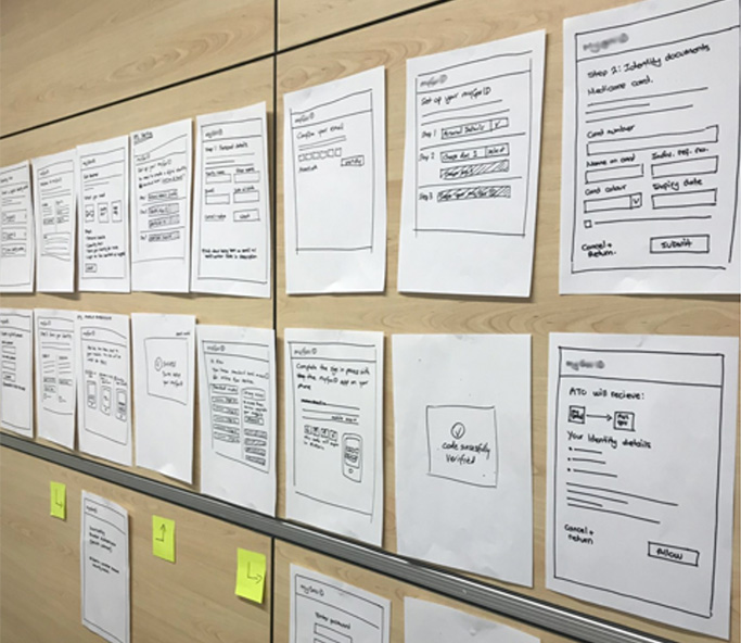
- Designing user flows: We began with paper prototypes to explore core interactions and flows across devices.
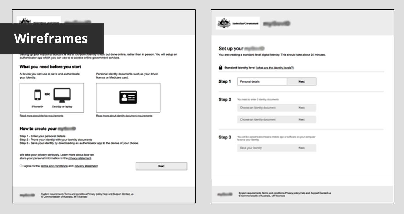
- Iterative wireframing: Using Axure, we translated these flows into interactive wireframes to define layout and navigation.
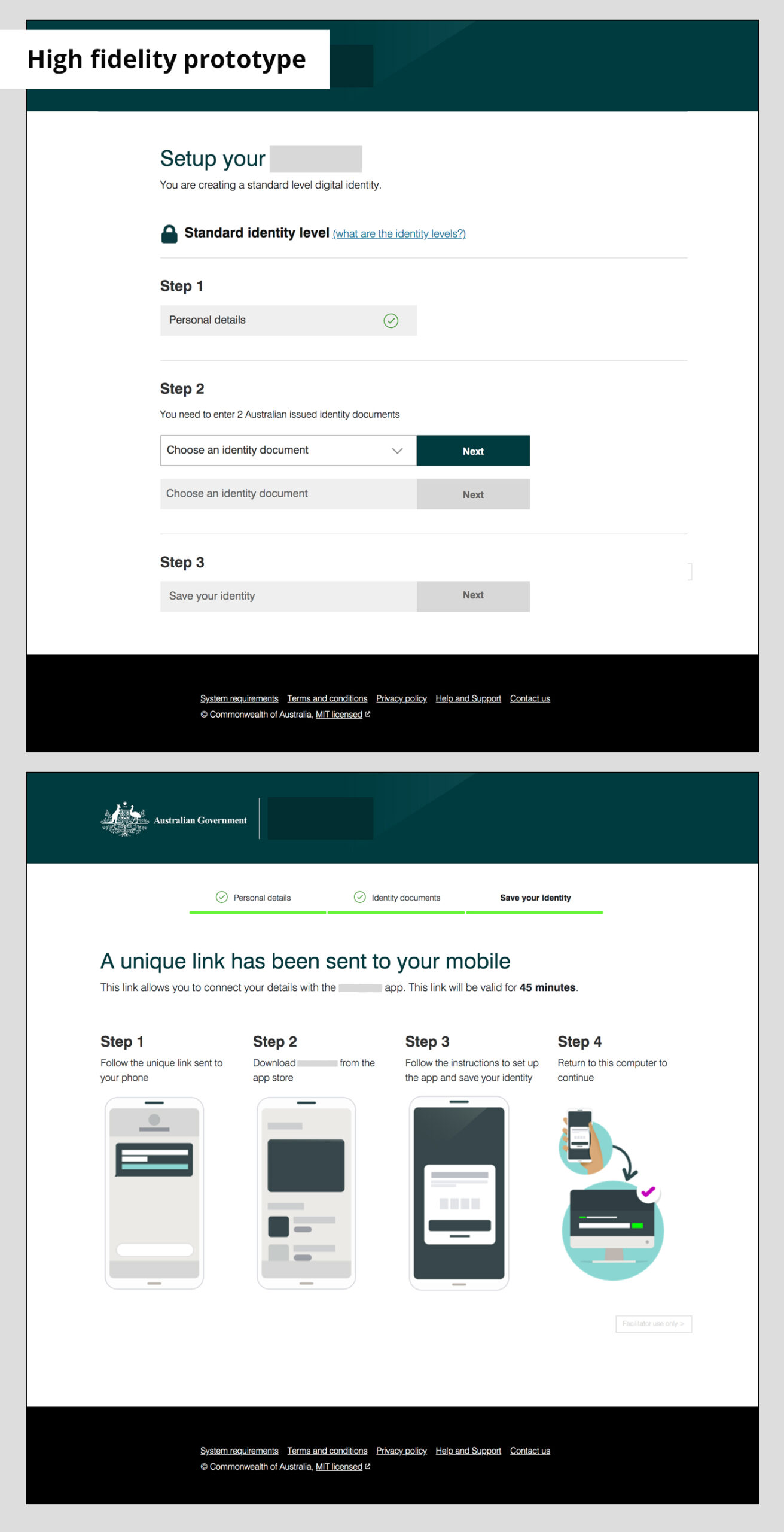
- Collaborative branding: We worked closely with the brand designer to ensure visual consistency with the existing mobile product.
- High-fidelity prototyping: We developed a functional HTML prototype with over 40 pages, enabling realistic user testing and stakeholder engagement.
In under six weeks, the prototype helped validate key design decisions and demonstrate the viability of a browser-based version of the product. It provided a clear path forward for improving the user experience across platforms and reducing friction during onboarding.